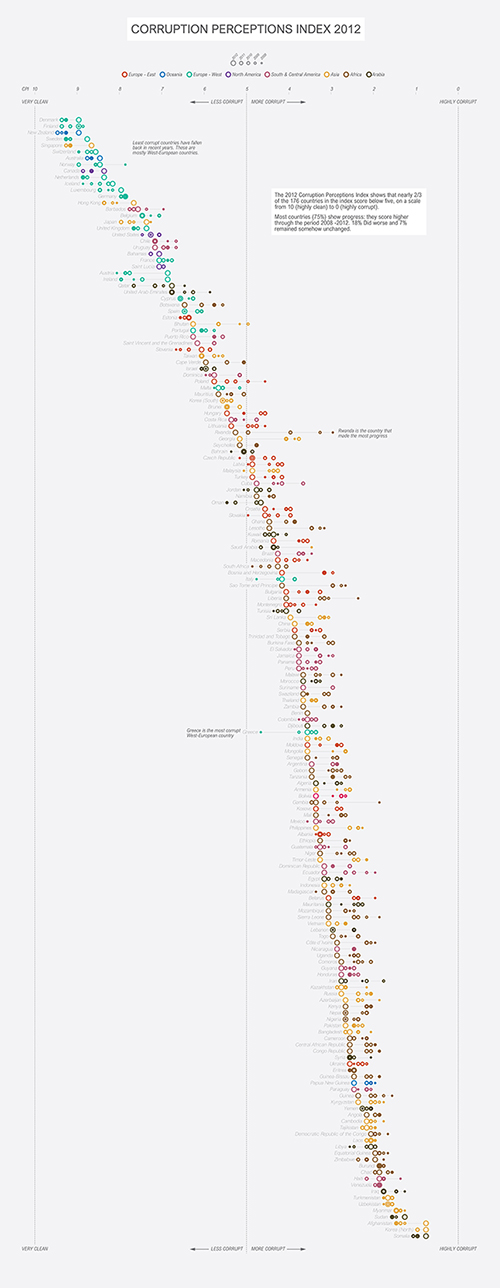
Independent / Corruption Perception Index datavisualization

This datavisualization was created as a contribution to week 11-2016 #MakeoverMonday (a Tableau initiative by Andy Kriebel and Andy Cotgreave).
It shows how countries range on the Corruption Perceptions Index, colors showing which continent, size of bubble showing which year is represented so you can also see progress.
Please do consider this visualization purely as a datavisualization-exercise and please do not communicate/share it as fact!
data via makeovermonday.co.uk: Transparency International: Corruption Perceptions Index
tools: Google Spreadsheets, RAW, Adobe Illustrator


