
Trees, clouds and waves.
Or, how I visualized data on suicide.
by Sonja Kuijpers
A bit more on the why
As described on the project page itself (link), my personal situation is an important motive of why I created “A view on despair” (thank you Sara Sprinkhuizen for your encouragement and checking and editing my project text). Other motivation came from visiting S-H-O-W last April, a dataviz conference organized by Graphic Hunters here in the Netherlands which theme was “Emotions in datavisualization and information design” (link). In advance I chatted with Goof Winkel, the organizer of S-H-O-W/Graphic Hunters, because I wasn’t sure I was going to be able to join. He kindly gave me the necessary space to even decide last minute. Thank you Goof! Also the people from the dataviz community who tried to uplift my spirit in that period: a warm thank you, you know who you are! I am glad that eventually I could go: great conference, great talks and lovely people.
I’ve always been intrigued by projects that have that emotional layer and one of the talks that made me ponder the most was one by Joost Grootens, whose work has been an inspiration to me for many years now. I think everyone in the field of dataviz should at least own one of his atlases.
He showed his project about the material damage caused by the US military intervention against ISIS (link).

What I think is so great about the project is that you’re viewing this beautiful graphic presentation and meanwhile realizing what you are actually looking at (the extent of the devastation). That somehow creates a conflict in your mind. I often say that you don’t want to make numbers look “nice”. Making it look nice and playful is how companies/governments sometimes ‘blur’ a serious topic to not scare off the public too much. But how Joost presents it, it transforms into something aesthetic and still tells the story. He could have chosen simple bar-charts or an engaging photograph of a destroyed tank, but this way it has more impact.
When I realized I wanted to create a visual about suicide numbers I also wanted to have it this internal ‘clash’. Not to shock people, but as this conflict between the aesthetics and the subject itself, which isn’t a subject to take very lightly.
Can I kick it? Yes you can. (link)
Reading along on discussions about viz-rules and when something is or isn’t datavisualization also makes me somehow ‘rebellious’. Of course I do follow the principal basics in my assignments, I actually get very cranky when a client wants to break or bend ‘the rules’ because they just want to fit something in or dismiss a part because they don’t think it’s that important or necessary (cherry picking!). And as I do look for new forms in these projects as well, it’s in my own projects where I get to really experiment with form and style. I explore what I can do with my tools and try to follow my intuition (which is hard because I still have problems trusting on it). And I look how far I can stretch the boundaries. By doing that it becomes dataart I guess.
We also have the tendency to turn everything into numbers (big data y’all!). Make everything a race for better, faster, higher profits. Everything in life is about logistics. Even death. I once worked on a project while I was in landscape-design (my former occupation) where we had to design an additional plan for a graveyard, and we also had to fit in a crematory (lots of restrictions there due to emission). The most challenging was that we had to make sure that the “pass-through speed” was utmost efficient and that one funeral gathering wouldn’t cross another one. I do get the part on the logistics but there’s still some discomfort here which you can consider a western taboo: grievance is not something expressed or shared easily, moreover, behold if others might witness it!
I hope we can remind ourselves more often on how Barbra Streisand brings it: ‘People, people who need people, are the luckiest people in the world’ (link).
Isn’t she right?! (all together: ‘Yes she is’)
(also, I finally got to sneak in Barbra in one of my texts ;-) )
On with the ‘how’.
I got the data at the website of the Dutch statistical bureau CBS (link). The numbers are divided into men and women. I chose the most recent year available (2017) and the data of the last 10 years categorized by age group and the several suicide methods (you can also sort by marital status and/or reason). I also got information from the Dutch suicide prevention service (113) on facts and numbers on suicide (link).
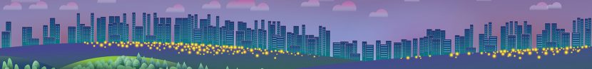
I started by thinking how to visualize these suicide methods without being too obvious or heavy or brutal. So, no nooses, pills, dead bodies or other realistic representation of people. I thought of elements that could in a way be associated with the suicide method, that’s how I first came up with the tree for hanging, the waves for drowning and the clouds for drugs.


Because I’m often too quick turning to my computer as a design tool, I enforce myself to sketch the ideas that come up although I’m not thrilled by the way I draw because it’s often messy. And I don’t use a neat sketchbook but the backside of old printouts which can get lost in my pile of desktop rubbish (but at least I’m doing something right here by cutting down on paper waist, right?).
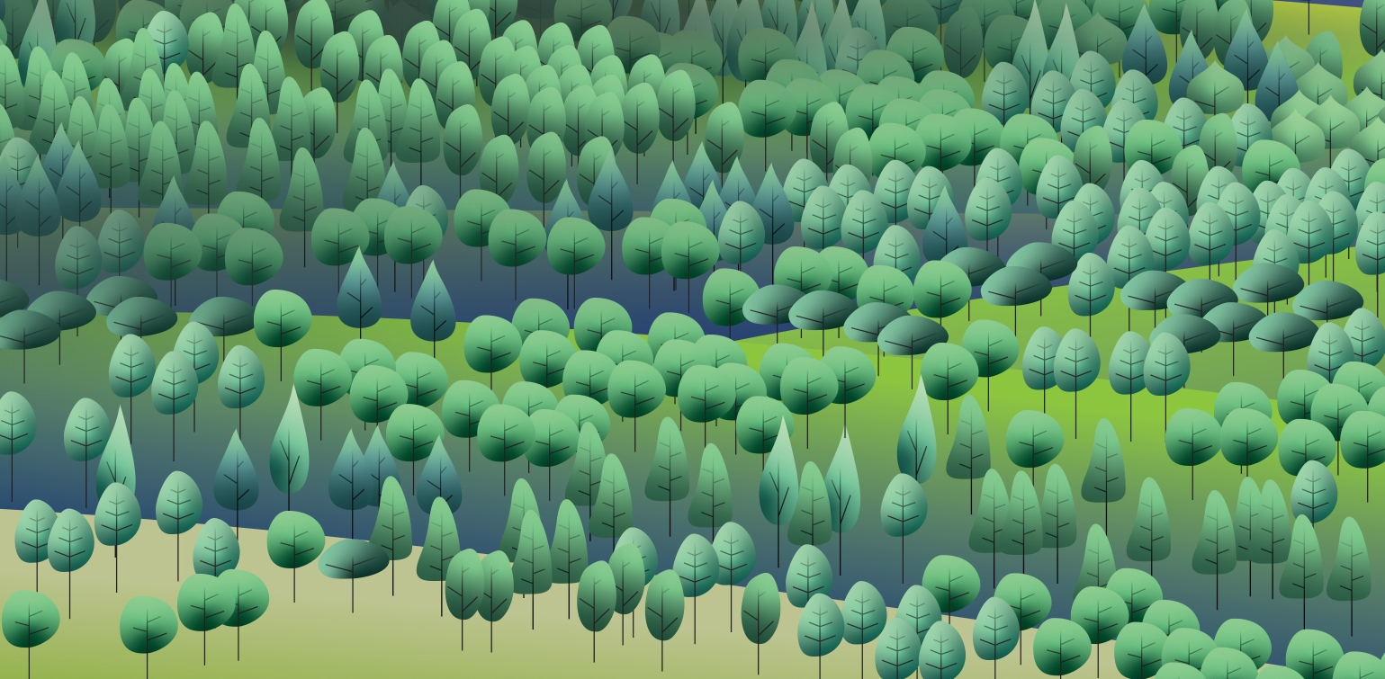
While I was sketching these elements, I thought of how to arrange the elements and that is when I came up with the landscape. After collecting some inspiring illustrations I started creating this landscape in Illustrator and meanwhile sketched on the other elements to implement.
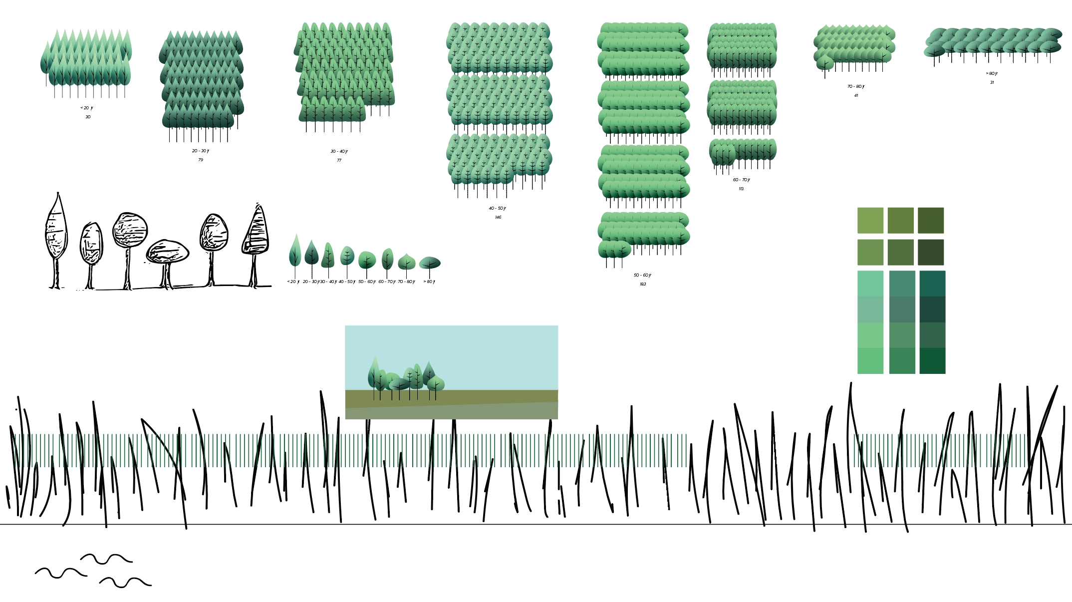
The train turned out to be the hardest because like I mentioned I didn’t want it to be too obvious and it had to fit in. They are now represented by light-dots (like headlights).

The elements differ in size, colour, both, or form, to label the different age groups. I also wanted to later show the difference in numbers between women and men, so I arranged the elements for men on the left and the women on the right of the landscape. And yes, I put all elements in manually (first putting them in blocks like in the picture above). All elements are sort of flat icons but I did want the landscape to have some depth so I added some extra layers with shadows and glows.
Yay, charts!
And of course, as I love dataviz, I did actually create some charts next to the dataart. I wanted to see and show what the proportions are, how the categories compare to each other, what the balance between women and men is and in which age group the most people commit suicide. I used Excel charts to examine the data and look for the best way to represent it. Once I found the fitting chart I copy-pasted it into Illustrator and styled it in there.
I find it worrying to see that I’m coming to an age (just turned 45) at which apparently the largest share of people decide to end their lives. That means it could also be one of my friends or relatives. It also reminded me of this graph which combined the results of several surveys on happiness. Its curves go down at middle age and hit bottom sometime in early 50s. That’s where “humans experience a midlife psychological ‘low’ (link). Well, when you’ve read my project introduction you know I can relate to this.

What’s also worrying is that there is a notable increase in suicides among young people. This is not only apparent in the Netherlands but also in the United States and Great Britain. The probable causes of this peak (link) in the Netherlands are currently being researched by a team of experts of different universities, youth help, several Dutch (mental) health services and 113 suicide prevention. Parents who had a kid who committed suicide are called for to participate in this research to get more insight into the backgrounds and possible reasons (link).
Conclusion
While working on the visual I sometimes got overwhelmed by the numbers. I do like repetitive work, it’s somehow meditative, but there were so many trees I had to place, so many clouds…. Those were all people that had ended their lives.
I really hope that I am not offending any of the relatives of one of those persons with my visualisation. It’s such a hard subject to talk about, to communicate in a correct way. It’s even hard to put down in fitting words what I want to show with this project. I don’t want to romanticize suicide with a nice picture, that’s one thing for sure. I want to pay attention to the fact that numbers are people, even when they’re gone. And I want the audience to realize. To realize “Wow shit, that many”. To process these numbers and give it some thought, to think about the people close to them and realize that even when they seem unapproachable, not eager to socialize, or hide themselves (especially when the hide themselves!), some of those people next to them could use a talk because you surely don’t want them to wind up in one of these visualisations.
Reactions
I had a very short chat with my niece, Marieke Kuijpers, who complimented me for my courage. I responded that I’ve been working so long and intensely on this project that I had distanced myself from the story. Not very consciously, but I handled it mostly as just any other project, focusing on the data and the design. By how people are responding now I am taken off guard. Of course, I hoped the project would resonate and that at least some people of the dataviz community would appreciate my work but wow…. I hit a spot I guess. People I don’t know personally, some people I haven’t met in years, are reaching out. They tell me how moved they are. And I am moved by that. I wanted to share my story and one of the consequences of how I grew up is that I am so scared of getting hurt that I am really bad at intimacy and receiving compliments. I live in my own bubble of hurt, not really aware how others might actually feel. And especially about me. I never thought of myself as courageous and different people now telling me I am feels intensely uneasy and emotionally confusing. Me, the never know what to do, keep my opinions to myself (if I even get to know what those are), turning into hyperventilating panic when someone gets too close too fast, insecure, controlling, self-deprecating dork, courageous?!
I still don’t know how to react (obvious). My patterns of self-protection are very strong. Maybe in time I will learn. I’m trying.
Thoughts
I mentioned that it wasn’t my intention to shock because I feel that that is a bad thing to do. But I get the idea that it still hit some people pretty hard. And I don’t know if shock is what people experience, but now I’m wondering if it is such a bad thing after all and also if it’s something we as dataviz-designers have to apply more often to get our audiences more engaged. Not in a preachy way and maybe not even in a too scientifically way? I don’t know, just pondering out loud… Shocking people these days seems to become a challenge because we got so accustomed to stupid outrageous things happening. But, there are certainly subjects that need the attention and awareness and in this fast-moving(-likely-to-be-gone-)world of over-entertainment we are forced to think of how we present these subjects. Another discussion-point maybe?
And in case you haven’t yet, you can read/watch the actual project here
Thank you for reading and if you have any questions or remarks, do reach out :-)
Sonja