
In May 2020 I got approached through an email by Per Anders Jorgenson of Fool-magazine. He asked if I was interested in doing a datavisualization for their upcoming issue. The theme of the issue would be Japan and they asked me if I could visualize the Japanese seasonal calendar for them.
//// Now I always ask a potential client if they can send me the data, so I can have a look at it. What’s the amount? Do I understand the question and information? Do I think I will be able to actually turn the data into a visualization? (is it suitable for a visualization?!). Also, when there is no budget assigned yet, I need the data to estimate the hours I’ll be spending to calculate my pricing on the project. ////
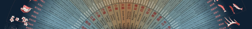
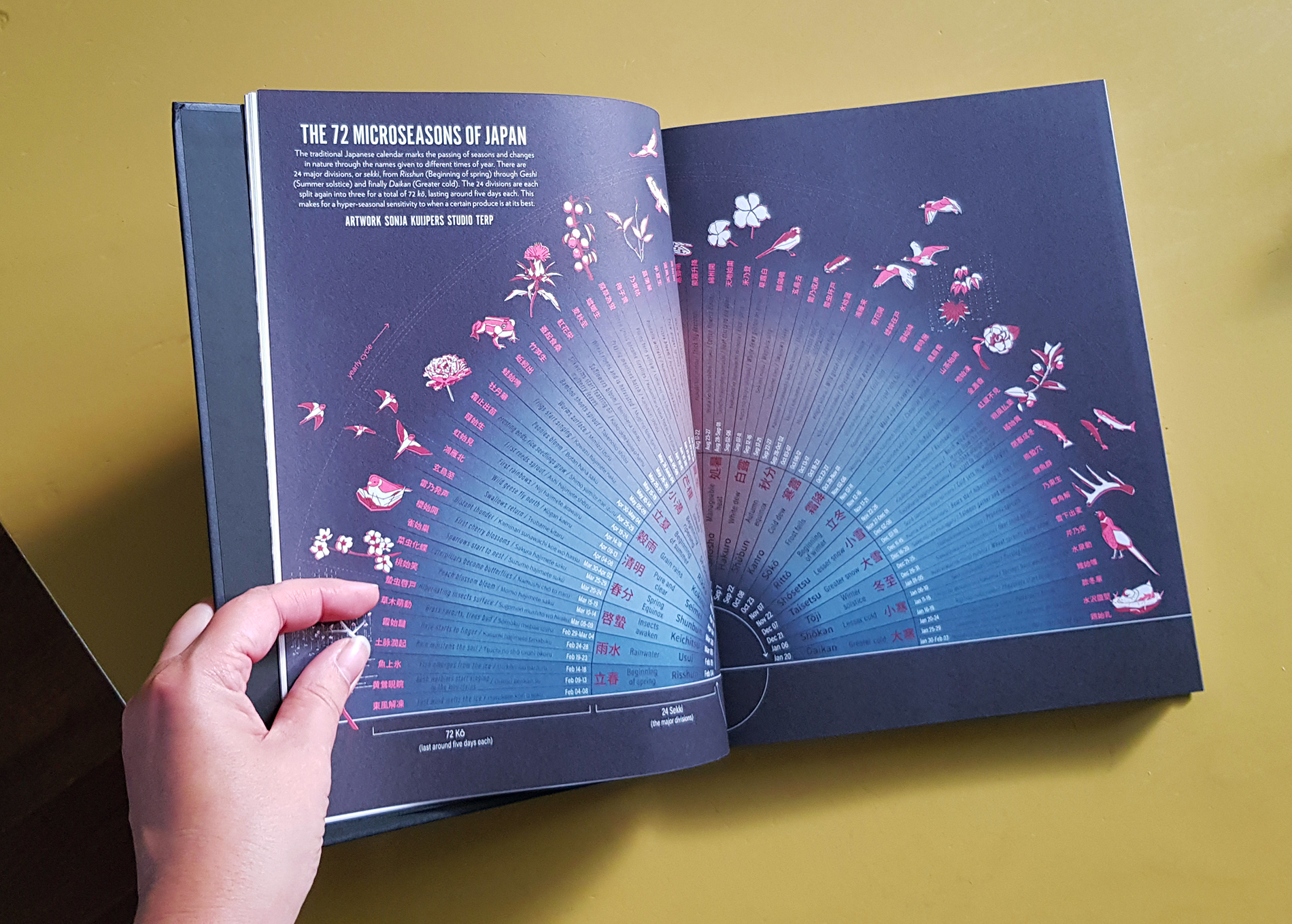
I had never heard of this calendar but soon found out that it had its roots in Chinese culture. The calendar was describing 24 Sekki (四節気, which are the main phases) and 72 Kō (候, the Sekki are each divided into 3 Kō). Each Kō, with a duration of 5 days, describes a certain seasonal aspect. I remember during my childhood being taught about the alternative old Dutch names of our Gregorian calendar, but these aren’t used any more. They did refer to the seasonal events however, like blooming, slaughter, harvesting. This Japanese calendar is much more specific.
The conditions of the project were as following: I received the request on May 4th, and the deadline for the final design was the end of May (publication would be June). The visualization was going to be a spread measuring 440 x 280 mm. I received the data (text) as an excel sheet. For the design itself, they gave me complete freedom to come up with an idea. Which is always encouraging and gives room to experiment shapes and styling.
I really liked the idea of all the different seasonal aspects, and I took on the challenge to express all of them. The first idea I had was to draw all Kō, combining three of the corresponding Sekki into a frame/view. So, 24 combinations of 3 Kō /illustrations. A sort of schedule laid out on the pages.
Full of enthusiasm, I created 3 Sekki as a sort of small landscapes each containing the 3 respective Kō. However, I soon found out that it would not be achievable, both in the amount of work as the readability of the total visual. Above this, it felt to difficult for me, perpetuating this level, not being the best illustrator. Some Kō were rather descriptive, and I didn’t know how to illustrate these.

Then, a bit disappointed but determined to do better, I went back to sketching the layout, how could I fit all the information in one readable visual? Which of course, should not only be informative, but also appealing?
I considered arranging all in a circle. I declared my love for circles before, and I have published several projects with a circular setup or circles as graph-shapes. Besides, as a calendar is representing a year, it is a time-loop, thus a circle would be the perfect shape. But then, as I was sketching, calculating, and thinking about the room it would take up in the layout, I found it just would not fit (big bummer!). I knew I had to put in all the text, but I also wanted to come up with some illustrative elements and there just wasn’t enough room for it.
Knowing myself, I wasn’t going to quit on the idea so soon (I can be really stubborn when I have an initial idea). I thought of alternatives for the circle layout, trying to still have all text readable and illustrations in it somehow. Then I came up with the semicircle. I created a setup of guidelines in Illustrator and I looked up the longest piece of text in the excel, copy-pasted it and set it at a readable font size.
//// A readable font size is a questionable remark. Readability doesn’t just depend on sizing, but also on the font style, its thickness, its color, and very important as well, the contrast between background color and type color. ////
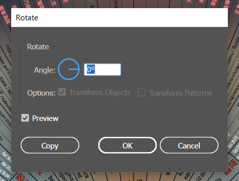
Now, I have been designing these sorts of layouts before, but I always find difficulty in the calculations/dimensions. Having to divide a semicircle into 24 and respectively 72 parts. I always start sweating when math is involved. I am learning though. A circle is 360°, so a semicircle is 180°. I am not going to elaborate on all the math I did (I think you all get the point, but also because I can’t remember exactly). I don’t have the screenshots on the process here, but in the end it is just a matter of putting in the copied text and then copy-rotated it at the correct angle.

//// There’s a very handy Illustrator solution that lets you rotate something from a point you indicate on your artboard (like the center of a circle). You select the object you want to rotate and then select the rotate tool from the toolbar. You press and hold the Alt-key and then click your cursor on the point you want as your rotating center. A menu pops up and you can type in the desired angle. And you can check copy. Which you can then repeat (using CTRL D) until you reach the desired instances of the object. ////

Anyway, I replaced the copies by the correct texts in the end, but for now I put in just a few texts. To indicate the loop of the calendar I drew a semicircle - arrow underneath. The colors of the different Sekki were picked to represent the temperatures of the time of year, warm vs cold. As I was searching for a way to add illustrations I realized I couldn’t put in all the Ko, so I started picking some that I had already drawn in the former idea and restyled some elements to fit my new idea.
//// Something about choosing colors though. I’ve had questions on how I pick my color scheme on other projects before, and let me explain just this: The path to becoming a Public Space designer, which is my former profession, started at Highschool where I had art(-history) as a subject. Then I got my associate degree (4yr) on Advertising, again with art-history as a subject and related subjects like graphic design and color-theory. After that I went to study at the Design Academy in Eindhoven which has a first year of various theoretical and practical semesters, which, as you may guess already, also contained color-theory and other linked subjects. So I think you can say I had a proper preparation. ////
Next to my education I think I have a pretty correct gut feeling on color. What I often do, is collect images of vizzes, graphics, other inspiring illustrations, photos, that have a certain feel and/or relate to the subject of a project.

inspiration: Adrianne Walujo
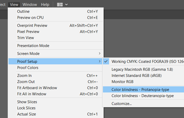
//// What I almost forgot to mention, do some testing for color-blindness! There’s a quick way to do that in Illustrator itself by choosing View – Proof Setup – Color blindness. You can also check by using an app or online simulator. ////
So, I had my setup, some elements and illustrations. I then send my ideas to the client (having put in a lot of time already as you’ve seen). I had my preference and explained my path. The client responded very excited about my idea (yay!).
From that point it was onward, putting all information in the setup. That wasn’t the most exiting thing to do, but what I do like about this kind of work is that it is repetitive and makes me relax. (Of course when it is not too much while that gets tedious.)
I had drawn 3 Kō and had to do at least 21 more. I started picking Kō that I could picture myself getting a good example off, googling images of some of the objects because I didn’t know exactly what they were. And sometimes it wasn’t clear to me what was meant by a Kō description, so I checked that as well.
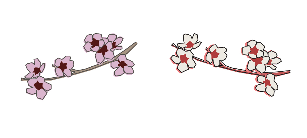
Now here comes the method how I made these illustrations. As I wrote, I googled for images of the subjects. I picked the ones that seemed a good impression of that subject. I then manually traced the image in Illustrator. Trying to catch the essence of it by leaving out as much detail as possible and only using straight lines. So I had a line-drawing. I decided earlier that I wanted to style the illustration by using only 3 colors: an off-white, a pink and a blood-red. I also used these as colors for the texts. I filled the line-drawings with the colors according the different colors of the subject itself or its lighting (highlights/shadows). I didn’t fill it accurately (within the lines) on purpose. I like the effect of 'sloppiness’, so I decided to use it as an extra effect. This way the illustrations would stand out more against the dark blue background.
")
//// Now I don’t consider myself a good illustrator, I can’t draw something from memory (I have a daughter who can: when you ask her to draw a giraffe, she draws a giraffe. When you ask me to draw a giraffe, it comes out like a dog-horse with a long neck and legs). My sketches are mostly some scribbling mess. I did however get incredibly positive reactions on the illustrations. If you are uncertain of your skills, like me, I recommend you find a way to apply some ‘tricks’ and follow various illustrators on your social media. Like I mentioned earlier, get inspired! ////
I arranged the illustrations around the circle and had some of them stray a bit so the total wouldn’t look too rigid. The way the texts were arranged was already a very compact and static layout and I wanted to have it a livelier look.

//// These are always challenging decisions to make and they can take up a lot of time, but in the end these decisions are what makes or breaks the visual (not really break, but more in the sense that if you pay attention to these sorts of things the visual will look more pleasant all over). ////

When everything was in place, I emailed the result to the client. There was some proofreading and editing to be done and a change of some colors (to let texts stand out a bit more). Unfortunately, due to Covid-19 there were some major hiccups on paper delivery, the printer broke down and the printing got delayed. And delayed. And, well. Eventually I received message that publication was scheduled, and the Fool Magazine went online for sale begin October. As I mentioned in the introduction, the issue is dedicated to Japan. It is 240 pages (!) magazine that contains gorgeous photography, stories on Japanese food and culture, and I am glad I am one of the creatives that were invited to take part.
I am not very comfortable talking about the financials of my projects, it is still a learning curve. Weighing what aspects are most important to me, next to receiving financial compensation. It did take me (way) more effort and time to create this visualization and under my regular fee this would not be feasible. But I saw this as an opportunity, I got total creative freedom (which is rare), and the design is mine.
Tools: Microsoft Excel, Adobe Illustrator.
Working on my Asus laptop and/or my Acer desktop with my big-ass iiyama monitor.
Collecting inspiration on Pinterest
Thank you for reading!!!
Might you be missing some information, feel free to ask me, I’ll be happy to explain or help you out.
If you are / know of any publishers or other people interested in my work, do get in touch ↓
info@studioterp.nl
Where to buy the Fool magazine: Foolshop or resellers