
Creating the Bayreuther Festspiele datavisualizations
The briefing
In Mai I received an enquiry by Holger Windfuhr, the art director of the Frankfurter Allgemeine Zeitung, asking if I would be interested in doing the datavisualization for an upcoming multiple-page special on the Bayreuther Festspiele.
At that time I had no idea what that event was about (my knowledge on classical music let alone opera is very meagre) but I saw a great opportunity and as I said yes I soon learned more about it.
Quick class for you folks: the Bayreuther Festspiele is an opera festival which was initiated (1876) by the composer Wagner to stage his own operas, which contain many mythical stories and figures. Ever since (except for the years of war and financial troubles) this Festspiele is being held in the opera house in Bayreuth (Germany), led by the descendants of Wagner. The festival is very popular but also spoken-off due to family-perils and the friendship of the Wagners with Hitler. The operas are played several times during a month.
Holger told me he had the idea of mixing my ‘delicate fresh style’ (which was flattering to hear!) with that of a certain comics artist, Attila Futaki. Holger send me a link to get acquainted with Attilas drawings and I was very impressed with them (and also intimidated by the fact that Attila had worked for the New York Times and created some best-selling graphic novels!).
I found the choice of combining my type of work with that of Attila (which is somehow rough and sort of dark) very intriguing and I was excited but also a bit nervous on how it would turn out.
While the special in total would contain 5 pages, the graphs I was asked to create would be laid out across 3 pages, each of the pages considering 1 topic. A (front-)page on the Bayreuther Festspiele itself and all operas, one on the opera Der Ring and another one on the opera Die Meistersinger. The layout of these pages was also up to me. The other pages were going to be filled with comics and illustrations by Attila.
the data
After Holger send me a list of the several subjects that would have to be visualized and explained me the global intentions of the pages I started reading into the subject and visited the website of the Bayreuther Festspiele. I learned the Festspiele were once started by Wagner himself and then continued to be organized by his ancestors.
Communications were mostly in English by the way, but I am Dutch; a proud citizen of the Netherlands (which is not the same as Germany or some province of it!) and I’ve had German as subject on high school so I could understand the matter quite easy although sometimes the jargon was a bit too specific and I needed some extra info.
tip: when you don’t understand the subject you’re about to visualize you will probably run into trouble visualizing the actual data because then you just won’t understand relations or cause and effect. Don’t be too proud or shy to ask your client for some background-info or explanation on technical language. It will enrich your own knowledge and create more trust from your client on you doing you very best creating the correct viz. Oh and!: do check the data provided especially when you find some outliers or textual hiccups. People (and yes, clients are also people) sometimes just make mistakes and you do not want to highlight those in your viz:-)
The data itself was pretty much assembled in Word-documents but since they weren’t so extensive it was pretty easy to distract the numbers and categories.
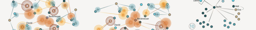
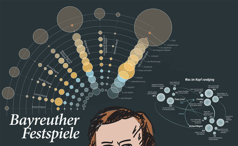
For the main-graph on page 1 (which Wagners ancestor was organizing the Spiele and which and how many operas did he/she present) I scraped data of the Bayreuther Festspiele website which was also easy because the information was well presented. I only had to do some minor manual calculations on the latest Spiele.

Some information came in a narrative form (like for the Prügelfuge on page 2) and I had to sort of label the information in order to come to a certain idea on what to visualize and how.

A question that has been on my mind during that process and ever since is what exactly is data (worth visualizing) and how do we decide on what to visualize when it’s a bit blurry and contains no exact numbers?
Ideas / sketching
For page 1 I first created a conceptual layout as I already kind of knew what sort of graphs were to be put in. The portrait of Wagner I produced myself cause I didn't have drawings from Attila (he was also just starting the project) and Holgers idea was to put a Wagner portrait in the middle with the graphs surrounding it so I just made a quick sketch as a placeholder. The idea was also to have one large graph and several smaller to achieve a nice balanced layout.
What Holger also emphasized is that he did not want figurative infographics so I had to rethink some initial graphs (like the page-count graphs bottom-left).
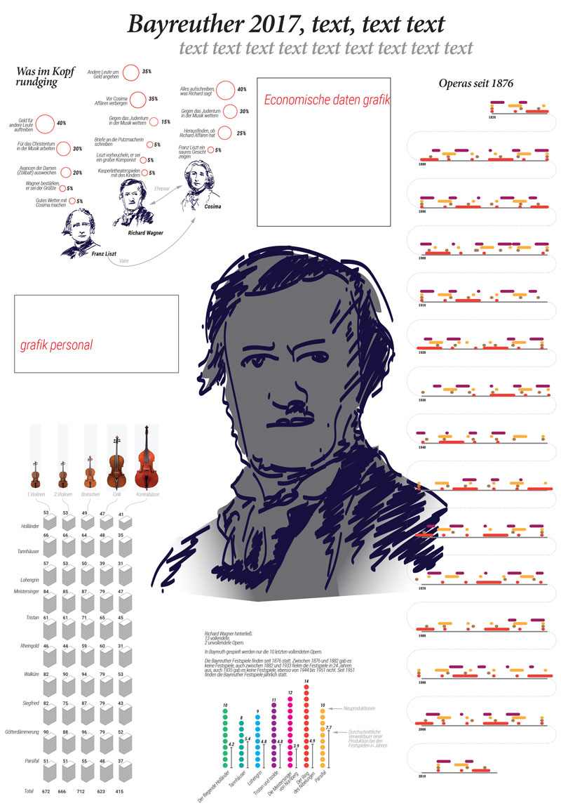
I created sketches by hand for several graphs and while some were very obvious (like the timeline), some other took me more steps to get to a satisfying result. One graph I found to be a bit of a challenge, which also was caused by the fact that the data wasn’t quiet the data I’m used to, was the Prügelfuge which is a fighting scene in the opera Meistersinger. As a mentioned earlier there was this piece of text and I did manage to get some grip on what/when/who but there weren’t any specific numbers (on timing, amount of people, number of punches). So I thought of visualizing the punches, not in a Comic way like this:

but more in a sense of a symbol showing direction and impact of the punch. It took me some sketches and a trial setup which I found was getting too crowded and too difficult to read to get to the final solution: small circles representing the participants on the fight and resonating circles representing the punches (lines indicating direction).


design
I went to work out some ideas in Illustrator. As I like to define outlines of a project I always start creating a color palette.
one of my first questions at the start of a project is always if a client has a corporate identity I should work with
On this occasion I asked Holger if he could provide me a pallet created by Attila so we could somewhat synchronize and we did communicate on it but somehow it never came about. Except for the request of Holger to have non-figurative, straightforward visuals I had total freedom on the design. As I initially sketched with circles, I later found that circles would be the format for all graphs.

I did try other shapes but somehow they just didn't work out that great and certainly at the end I felt it was the right choice to harmonize the different graphs. During the design-process I changed the layout of the pages a few times while some graphs changed or were deleted. There were several struggles on some graphs cause they just didn’t show enough differentiation or in another case the editors wanted a somehow more mainstream graph (like a donut-chart which I argued, then founded my arguments and gladly convinced them otherwise). We also tried to do all pages in a dark layout with a dark-blue background but then Holger suddenly realized it was not practical: it is a newspaper and the paper is not that suited for overall-dark printing and above all the color would come-off on hands and tables while reading. So we turned to a light setup again.
Some visualizations I myself am mostly satisfied with (also thinking of the extra effort I had to put in):
The family tree of Wagner which I had another idea on but that seemed to be too sophisticated (I’m still thinking on inserting that idea into another project). Then it was decided upon to layout in a classical way which I think turned out very nicely.


Once the main layout and graph designs were finished there were several edit-rounds. The correct text was added (by the FAZ-team), some data was added which I had to incorporate, the final dots.
Just before the paper went into print Holger informed me that the Feuilleton would be printed an extra run of 25.000 copies to be handed out at the opening of the Festspiele, great right?! As I earlier wrote I was a bit nervous on the way the pages would turnout and as I didn’t receive a color-pallet by Attila I was very pleasantly surprised to see how the graphs and illustrations fuse together: Somehow the colors are alike and the total-look and balance is perfect: I’m very pleased with Holger sensing this upfront!
As promised Holger send me a few copies of the Feuilleton and it’s always so exiting holding a printed item of your work. I do admire (and envy) all the sublime online interactive projects of colleagues and the colors sometimes have so much beautiful depth on screen but somehow touching and not to mention smell(!) the fresh paper print is really something.
one last thing: You can think of yourself as a good and capable designer but it is also very helpful to have a client who is professional and who oversees the working-process. Do not underestimate: “Communication people, communication!”
I in this case was very lucky to be working with Holger: when a project like this is taken care of by people like him it’s a true pleasure (as it should be!).
finals


See the project page here (including all individual graphs)
I hope you enjoyed reading my write-up, when you’d like to know more or have other questions about my work please do not hesitate to contact me.
Sonja